5 Steps To Create A Frictionless Checkout Experience
How to make buying from you so smooth and simple that customers complete their purchase without hesitation
- October 21, 2025
- Indra
- 7:41 am
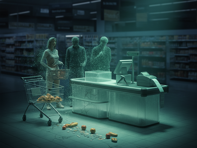
The silent problem costing you real sales
You work hard to get people to your site. You post on Instagram, tweak your offer, run small ads, and finally see a steady stream of visitors clicking Buy now.
Then they stop.
They reach the checkout page and vanish. No payment. No confirmation. No explanation. You watch the analytics show abandoned carts climbing while your actual sales stay flat. It is frustrating because you know your product or service is valuable. The problem is not interest. It is friction.
A clunky checkout process quietly kills conversions. The more steps, distractions, or doubts your buyer faces, the faster they back away. The truth is that people do not decide not to buy. They simply lose momentum.
Creating a frictionless checkout is one of the fastest ways to increase revenue without changing your product, your price, or your traffic. It is not about technology. It is about empathy, simplicity, and flow.
What you will learn
- Why checkout friction costs you more than you think
- Step 1 Simplify every decision your customer must make
- Step 2 Make safety and trust visible at a glance
- Step 3 Design for mobile first not as an afterthought
- Step 4 Reduce clicks and time to purchase
- Step 5 Use automation and follow up wisely
- Real examples of frictionless checkout done right
- What numbers to track for real improvement
How to keep the buying experience effortless as you grow
1. Why checkout friction costs you more than you think
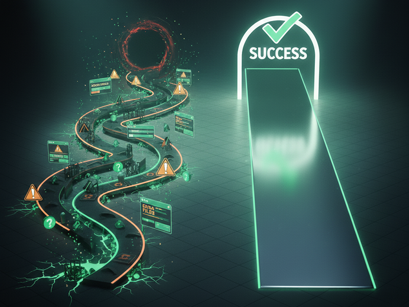
You can have a brilliant offer and still lose customers because of a poor payment experience. Friction is the invisible tax you pay for inefficiency.
Why this happens
Friction hides in plain sight. It lives in extra form fields, slow loading pages, unclear buttons, missing payment options, or design elements that cause hesitation. Customers who were ready to buy suddenly pause to double check something, and that pause kills momentum.
The human brain prefers clarity. When checkout feels confusing or takes too long, people subconsciously retreat.
What this costs you
Imagine that two thousand people reach your checkout page each month. Five percent complete a one hundred dollar purchase, which earns you ten thousand dollars in revenue. If friction drops that to three percent, you lose four thousand dollars every month, almost forty eight thousand a year, because of something fixable.
How to fix this
- Map your current checkout process from a buyer perspective
- Count how many steps it takes to pay
- Identify where users might hesitate or question something
Then simplify until there is no hesitation left.
Key takeaway Every second of friction costs you trust, momentum, and money.
2. Step 1 Simplify every decision your customer must make
Your customer has already decided to buy. Your job now is to make the yes as effortless as possible.
Why simplicity converts
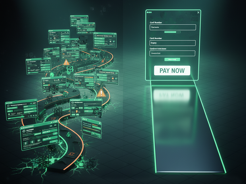
Decision fatigue is real. When people face too many options, they freeze. A cluttered checkout page filled with multiple forms or cross sells creates cognitive overload.
How to simplify
- Keep checkout on one page
- Show totals early to avoid surprises
- Ask only for essentials such as name, email, and payment
- Make the button unmistakable so the next step is obvious
How this looked in practice
A digital course creator used a three step checkout process hosted on different pages. When she condensed it into a single Stripe form with instant confirmation, her completion rate rose from three point four to six percent in two weeks.
Key takeaway A simple checkout feels professional. Every extra click is one more chance to lose a sale.

3. Step 2 Make safety and trust visible at a glance
Even when customers want what you sell, fear can stop them. They worry their payment might fail, their data might leak, or the product will not match expectations.
Why trust matters
Buying online requires belief. Your customer cannot touch your product or look you in the eye. Trust signals act as a handshake that proves it is safe to move forward.
What to include
- SSL certificate and visible lock icon
- Secure payment badges from Stripe, Visa, or PayPal
- Refund policy placed near the checkout button
- Short testimonial or rating near the payment area
In action
A business coach added a small note under her payment form that read Secure checkout powered by Stripe trusted by over a million businesses worldwide. Her checkout abandonment rate dropped twenty one percent in one week.
Key takeaway People do not buy only your offer. They buy the safety of your process.
4. Step 3 Design for mobile first not as an afterthought
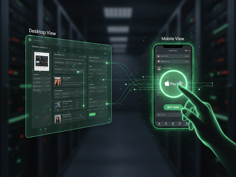
More than half of online purchases now happen on mobile devices. If your checkout feels clunky on a phone, you are losing customers before they even see the confirmation page.
Why mobile matters
Mobile users expect instant results. If they need to zoom, type too much, or scroll endlessly, they quit. Designing for mobile is not about shrinking your desktop page. It is about rethinking it entirely.
How to optimize for mobile
- Use vertical layouts for natural scrolling
- Create large centered buttons that are easy to tap
- Enable Apple Pay, Google Pay, or PayPal
- Allow auto fill for returning buyers
Lesson from a small business owner
A handmade skincare brand saw that seventy percent of its visitors came from Instagram. Their checkout was not mobile friendly. After switching to a responsive one page layout with Apple Pay, mobile conversions rose forty two percent in a single month.
Key takeaway Your buyer’s phone is their store. If the experience feels awkward there, they walk away.
5. Step 4 Reduce clicks and time to purchase
The faster the checkout, the higher the conversion. People rarely abandon because of price. They abandon because the process takes too long.
Why this happens
Every second after the buying decision increases risk. Distractions appear, hesitation grows, or the browser crashes. You cannot control distractions, but you can shorten the path between intention and payment.
How to fix it
- Keep checkout on your own site instead of redirecting
- Save payment details for returning buyers
- Send instant confirmation emails
- Keep load time under three seconds
An example in numbers
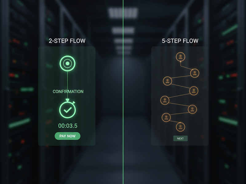
A stationery store reduced its checkout from five steps to two. The change doubled conversions from two point seven to five point four percent and added about nine hundred dollars in new monthly revenue without more traffic.
Key takeaway Convenience drives completion. Each second saved adds trust.
6. Step 5 Use automation and follow up wisely
Sometimes people abandon checkout for simple reasons. Automation can bring them back without pressure.
Why this works
A well timed reminder revives intent. It nudges buyers gently and reminds them they already wanted your product.
How to do it
- Send a reminder within twenty four hours
- Reassure buyers that payment is secure
- Use a friendly tone instead of sales language
- Automate thank you and receipt emails
Here is what happened
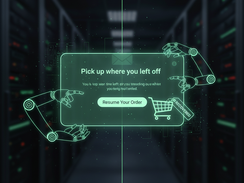
A digital planner shop added Shopify cart recovery emails with a single line that read Pick up where you left off. That automation recovered nineteen percent of lost checkouts in one month.
Key takeaway Good automation feels like customer care, not a chase.
7. Real examples of frictionless checkout done right
Case in point
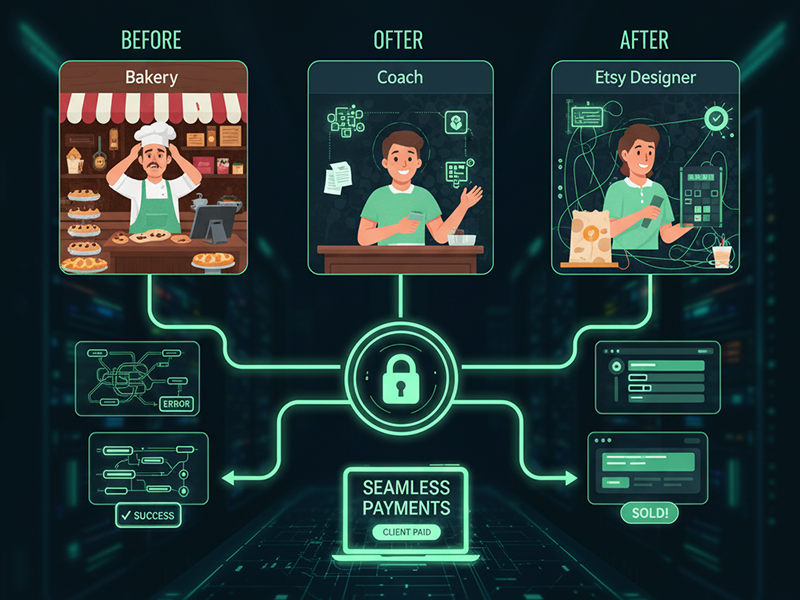
A bakery in Austin once handled preorders through direct messages. They introduced an online form with Stripe payments and instant receipts. Their weekly admin time dropped sixty percent and repeat orders increased twenty six percent in three weeks.
How this worked in real life
A creative coach connected her Calendly bookings directly to Stripe so clients could schedule and pay in one step. Her no show rate fell thirty eight percent.
A story from the field
An Etsy jewelry designer replaced her multi page checkout with a single page inside her site. Cart abandonment fell from sixty eight to thirty nine percent, adding more than one thousand two hundred dollars in monthly revenue.
Key takeaway When buying feels easy, customers come back again and again.
8. What numbers to track for real improvement
You cannot optimize what you do not measure. Checkout data reveals exactly where friction hides.
The key metrics
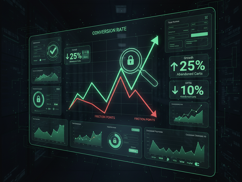
- Checkout conversion rate showing how many start and finish payment
- Cart abandonment rate revealing lost intent
- Average order value which often rises when checkout feels seamless
- Refund rate which drops when trust grows
- Page load time which affects every single buyer
How to interpret it
Even a one percent lift in conversion each month compounds to twelve percent growth a year. Use Stripe analytics or Google Analytics to review performance weekly.
Key takeaway Data replaces guesswork with clarity.
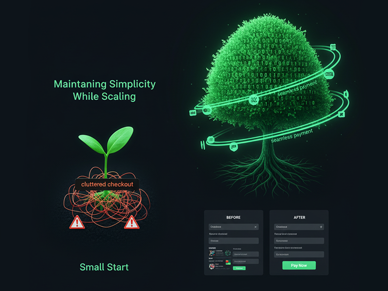
9. How to keep the buying experience effortless as you grow
Growth brings complexity. Without regular review, simplicity fades.
Why this matters
As your business expands, you add new tools and checkout paths that slowly reintroduce friction. What began as easy becomes cluttered.
How to prevent it
- Review your checkout flow every quarter
- Test it on mobile, tablet, and desktop
- Watch a friend complete a purchase and note every pause
- Remove extras that do not help completion
A before and after transformation
Before A digital membership platform used three checkout pages and had frequent payment errors.
After They simplified to a single Stripe page with automatic confirmation. Completion rate rose from eighty eight to ninety six percent and support tickets were cut in half.
Key takeaway Growth should multiply customers, not complications.
Bringing it all together
A frictionless checkout is not about fancy software. It is about empathy. It respects your customer’s time, focus, and need for clarity.
You have learned to
- Simplify decisions and remove clutter
- Show clear trust signals
- Design for mobile first
- Accelerate payment flow
- Automate helpful follow ups
- Track and refine with data
When your checkout feels effortless, it communicates respect. That experience builds loyalty that lasts long after the first sale.
A simpler way to keep your business flowing
Making checkout easier is not just about earning more. It is about building confidence in every customer interaction. The smoother your systems, the more freedom you have to focus on creative work and client relationships.
If you are ready to simplify how you manage offers, payments, and client experiences, visit Briefee. It helps small business owners and independent professionals organize their workflows, communicate clearly, and grow without complexity.
When your business flows, success follows.
2025 © Briefee. All Rights Reserved.
